Thursday, June 10, 2010
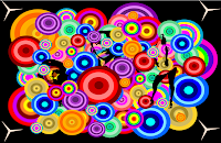
Dots

Thursday, May 27, 2010
Spring Arts Fesitval
 For the Spring Arts festival we had to create picture for our parents to look and see what we have been doing. I created a Frog and made a very simple backround to go with it. Then I also added some text. I created some bubbles by myself too by using the skills we learned at the beggining of the year by using simple and basic shapes to create something. I made circles and then gave it a stroke to make them look like they are underwater bubles. Making something and then putting a backround can really change the picture and make it look alot more intresting.
Spring Arts Festival

Monday, May 10, 2010
Magic Wand

Bubble Text
 Making This text was very simple. I had to learn how to move and scroll around the text and be able to use the Fill & Stroke tool.I had to also use the bezier tool to pull out letters from each other in order to make it give that bubble effect. It was a challenge for me because you had to be carfeul not to drag it out to far otherwise the bubble would be humungeous and you had to be careful not to pull out to little otherwise you cant see a difference.
It goes pretty fast and is a quick way to make a bubble text.
Thursday, May 6, 2010
Reflection Text

Bubble Text

Monday, April 26, 2010

Thursday, March 11, 2010
Macro Skills
 Using the Micro option on the Camera was very intresting. I learned many new intresting ways. To take a good picture using the macro option you have to take tons of pictures like you usually do, so atleast one pisture is the way that you want it to look like. For Macro you need to get very close to your object so you are about to touch it. To make the picture maybe look a little more intresting you should try and change the persepective of the picture or take it from far below or form far above.
On the Picture above you can see that i tried to take a picture of the intresting pattern which goes zig-zag. In between each zig-zag there is dirt. The dirt is clearly visible and it makes the picture look very niceand giving it this nice touch of nature.
The macro function makes yoube able to see things that you dont see with your bare eyes.
I have a camera at home and im sure i have the macro function on it because i see the "flower" icon alot but i never really knew what it was for. Now i know that i can use it to take intresting pictures from up close.
The Macro function shows many things which are really intresting, for example it really shows some outlines and bumps and dirt that we usually dont look at or notice when we look at the corner of a bench or a piece of wood.
Thursday, March 4, 2010
Beach Picture
in this picture you can see that there is a bunch of people jumping up. This picture shows that the photgrapher had to most probably take tons of pictures to get one good one. This picture shoes that the rules are broken. no rule of thirds... no symetry.... no depth of field.
Sunlight from WIndow
In this picture the sunlights come right through the window. The photographer of this picture took put the window at the side which makes it a little more intresting for the eye to look at. Its a really beautiful picture. This picture is an example of the Rule of Thirds
Paint
59:365 "photography makes us feel that the world is more available than it really is." - susan sontag, originally uploaded by julochka.
I really like this picture because the depth of this picture makes it intresting. The paint looks like it was just freshly used and the depth gives the picture a more intresting effect.
Girl on a Railway Track
The photographer made this picture look very beautiful and has nice tones. The train Tracks in this picture show symetry and look like they never end.
Wednesday, March 3, 2010
Digital Photgraphy

Monday, February 1, 2010
Penguin

Monday, January 25, 2010
Boy
 After Creating the Hearts we learned how to make a cartoon Head. In order to make this cartoon head you had to start of with simple shapes. I made this head using Youtube. On Youtube there are videos on how to make the Boy. First i thought i wouldent be able to make it look like a boy but if you follow the steps they go easier and easier.
I Learned a new Tool called the Bezier Tool. This tool allows you to be able to move any line or shape however you like. We learned how to control and get more confident with the nodes. once you work alot with the nodes it goes easier. You should make sure you dont have to many nodes because the object looks better with hardly any nodes.
I really likes making this boy because i learned more tools on Inkscape drawing this Boy.
Heart with a Backround
 After learning how to do a heart we learned more and more advanced things to add to the Heart to make it look more realistic and intresting to look at. In the picture above i learned how to add a sparkle to the heart and to make a backround. I also learned to make another backround to the heart to make it more advanced. I learned how to do this just out of a simple circle again. It now makes the heart look more like a 3-D shape instead of just a flat hert drawn on a piece of paper.
In order to get the backround for the Heart we need to duplicate it and make it a little smaller than the first one. I also learned how to use different tools through watching videos on Youtube other people have created. Making this heart i found out alot of tools to make the heart seem more alive and creativ.
Thursday, January 21, 2010
Learning things on Inkscape
